Silverstripe style guide
Here are the assets and guidance for applying the Silverstripe brand, which is the brand for our company.
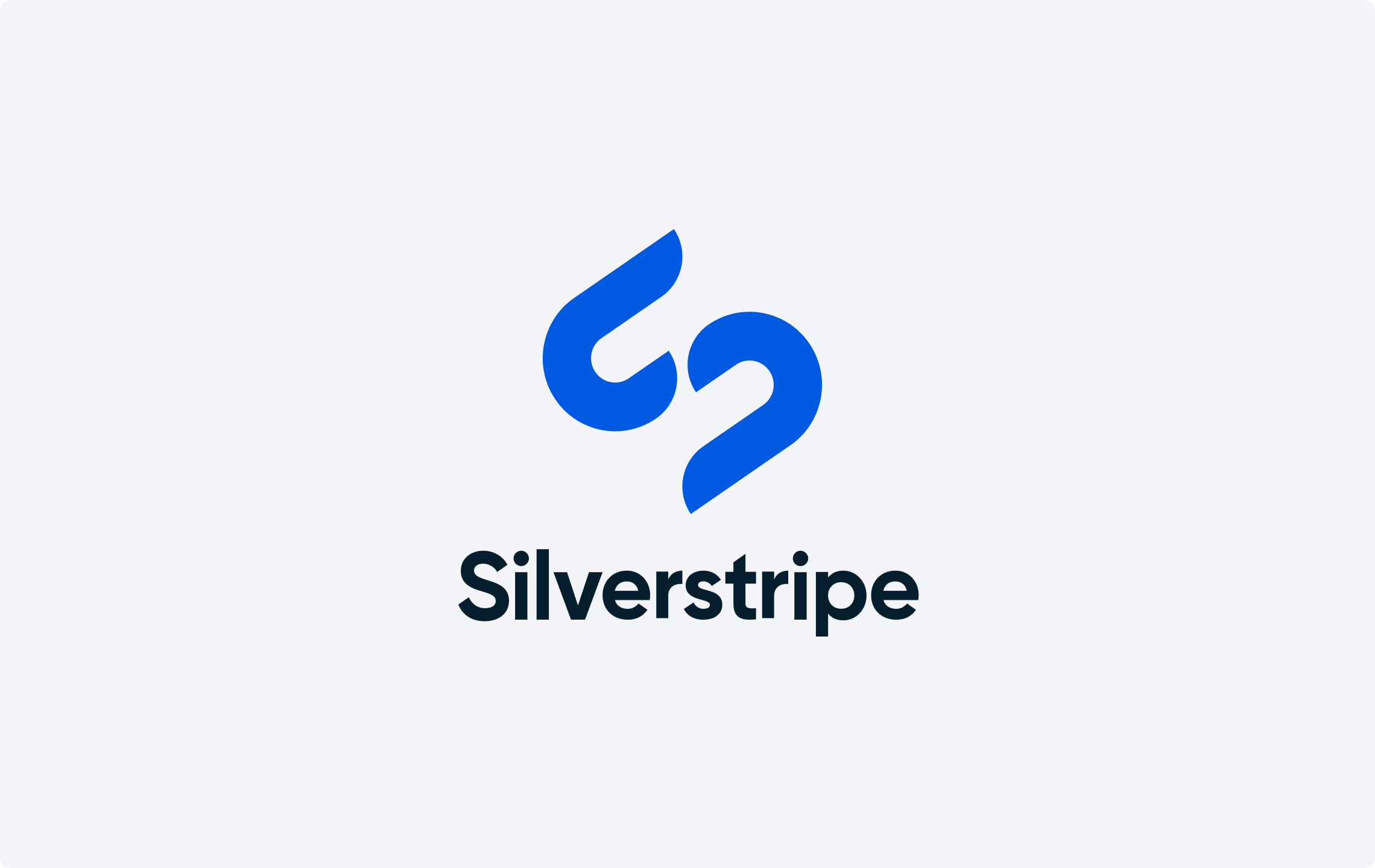
Symbol
The Silverstripe symbol, in its current form, first appeared in 2011 and has become synonymous with the Silverstripe brand. Our symbol forms part of the Silverstripe logo but can also be used in isolation to represent the brand. The symbol can be presented in Bright Blue on white/light grey or in white on Bright Blue, or on a secondary brand colour or imagery with sufficient contrast.


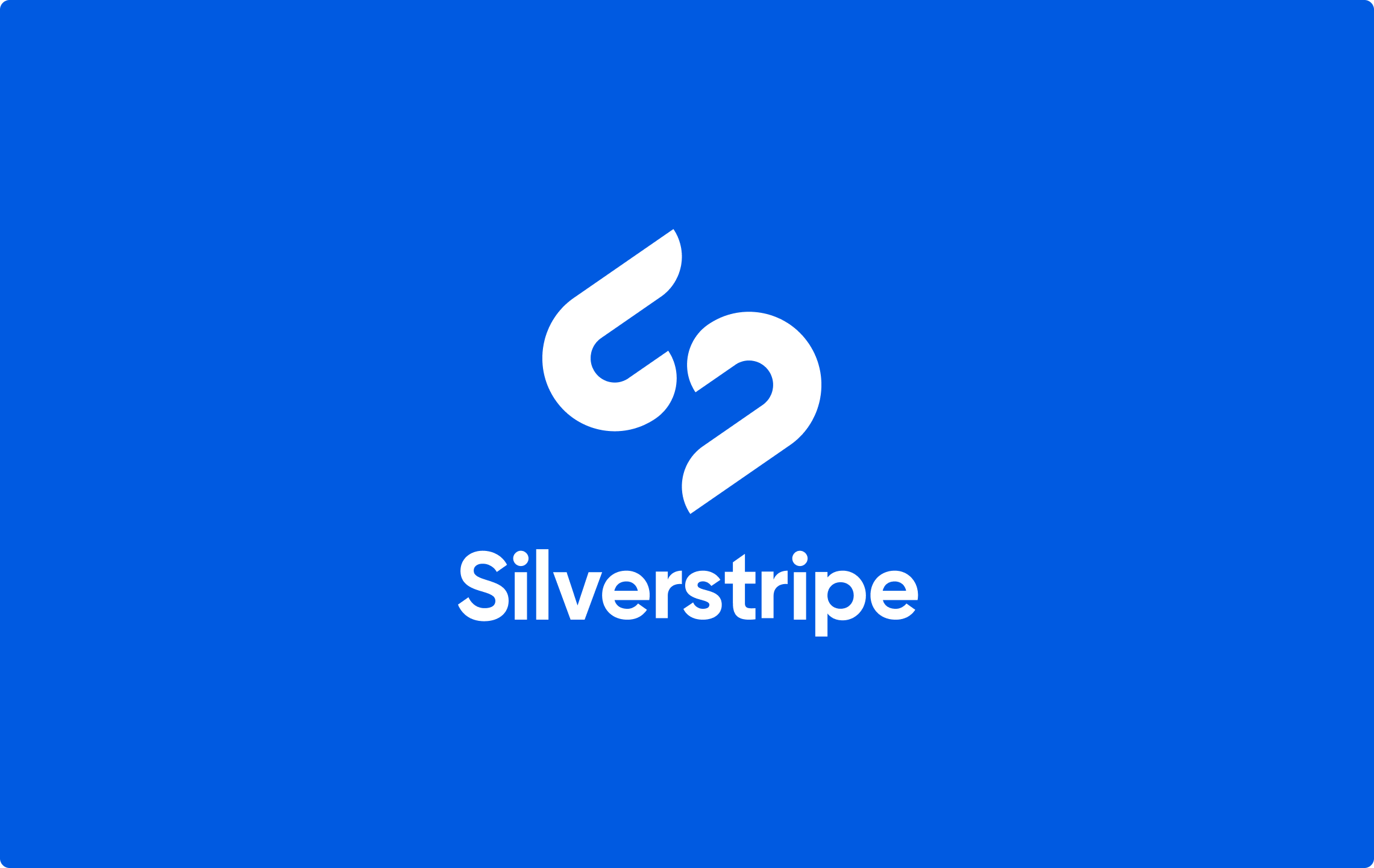
Logo
The Silverstripe logo is composed of a simple, elegant symbol, and a clear, bold wordmark. The horizontal logo is the primary format and should be used in most instances. The logo can be presented in full colour on white or in white on Bright Blue, or on a secondary brand colour or imagery with sufficient contrast.
Clearspace
The minimum clear space allowance can be ascertained by the width of the S from our wordmark (as pictured). Do not place any graphics, illustrative elements or type, closer to the logo than indicated here. Do not reproduce the horizontal logo any smaller than 30mm on all printed material and 120 pixels on all online material. Do not reproduce the stacked logo any smaller than 20mm on all printed material and 80 pixels on all online material.
Colours
The bright and bold colour palette is an integral part of the Silverstripe brand personality. White should be used liberally to keep the overall tone light, with more vibrant colours used to support this. Following these colour definitions will ensure there is consistency across all forms of media. RGB and Hex/HTML are used for online collateral which will appear on screen/digital devices. Pantone and CMYK are used for printed collateral.

Bright Blue
HEX #005AE1
RGB 0 90 225
CMYK 90 62 0 0
PMS 285 C

Blue Black
HEX #051E2D
RGB 5 30 45
CMYK 100 70 30 85
PMS 296 C

Pink
HEX #CD0F69
RGB 205 15 105
CMYK 0 100 20 0
PMS 214 C

Yellow
HEX #FFCD00
RGB 255 205 0
CMYK 0 5 100 0
PMS 108 C

Aqua
HEX #3CDCBE
RGB 60 220 190
CMYK 60 0 25 0
PMS 333 C

Purple
HEX #5A2392
RGB 90 35 145
CMYK 85 100 0 0
PMS Medium Purple C

Charcoal
HEX #2D2828
RGB 45 40 40
CMYK 0 5 5 85
PMS Black C

Pale Grey
HEX #F3F5F8
RGB 245 245 250
CMYK 0 0 0 5
PMS Cool Grey 1 C
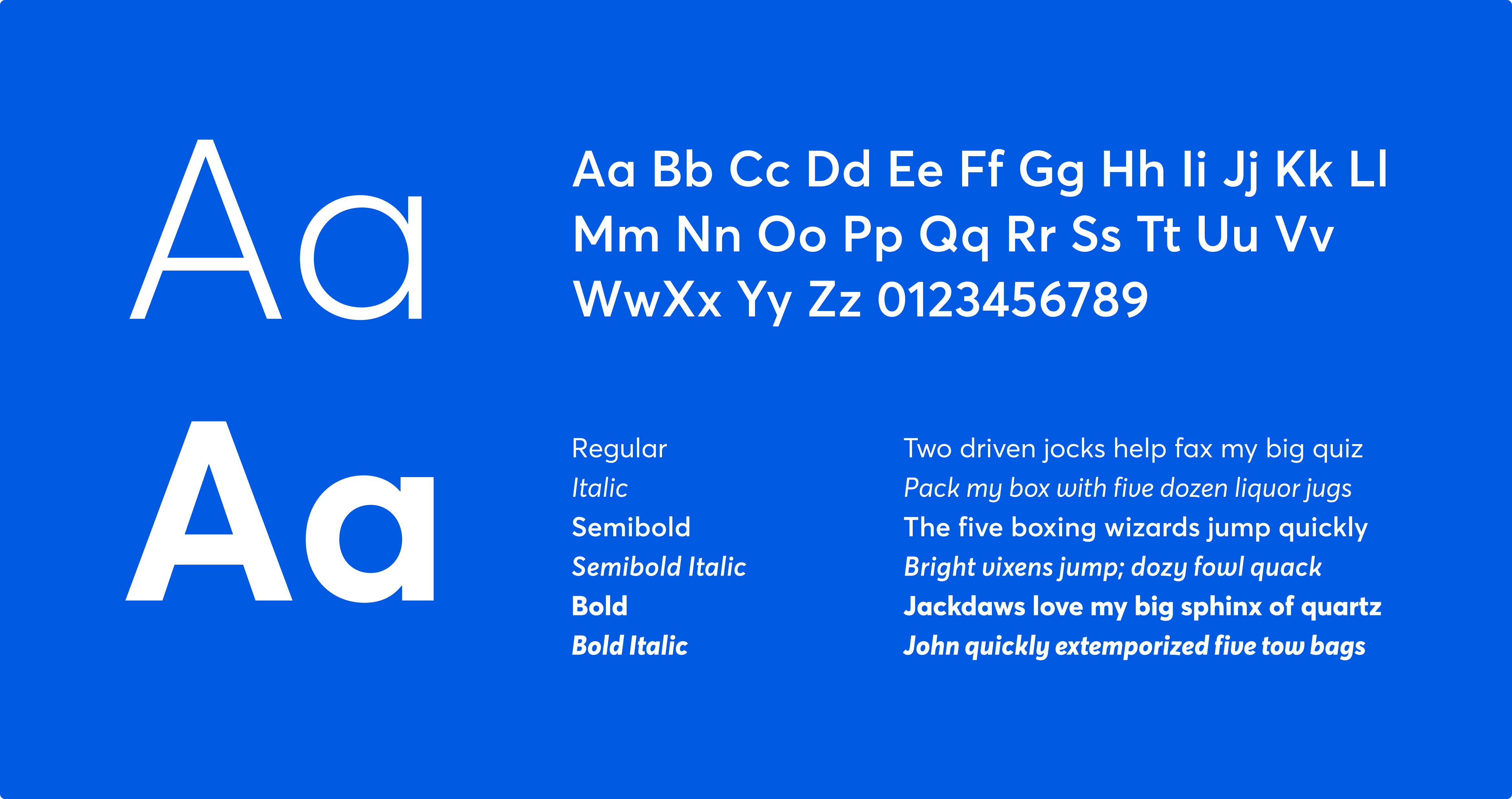
Typography
Meet our primary typeface, Averta. Averta is a geometric sans serif family made by the award-winning designer Kostas Bartsokas. The purely geometric rounds, open apertures, and its low contrast strokes express an unmoderated, straightforward tone, resulting in a modern, neutralist, and friendly typeface.
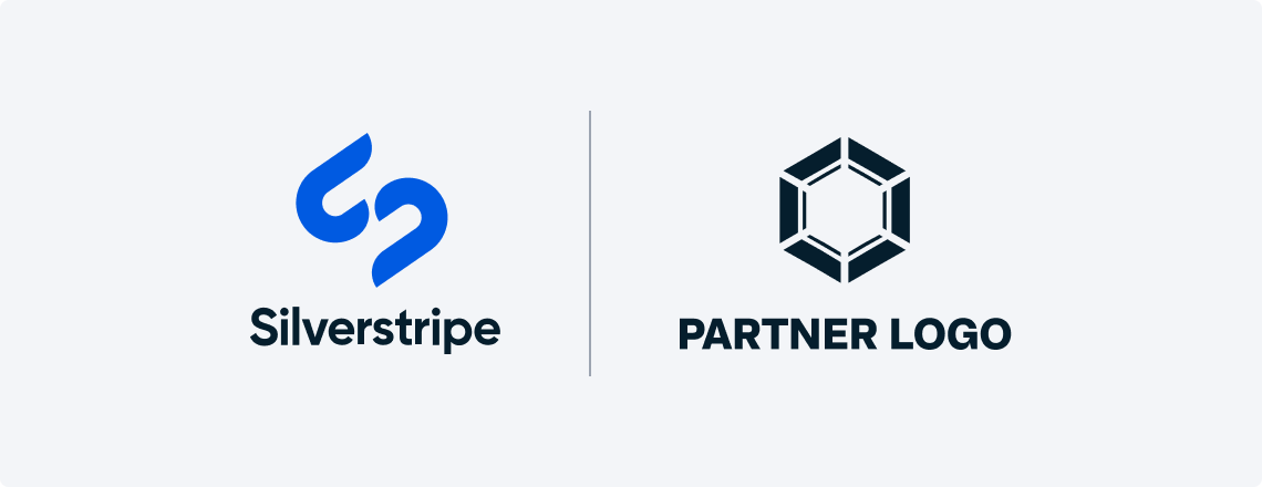
Co-branding
The weighting of the Silverstripe logo and the partner logo should appear visually similar, with the Silverstripe logo ideally sitting to the left of the partner logo. Both logos should be close to equal size, so the horizontal or stacked version of the Silverstripe logo should be chosen based on the shape of the partner logo.

Things to avoid
To maintain the consistency of the Silverstripe brand, it is important to not recreate or reinterpret the logo. Ensure that clear space rules are kept, and that there is a sufficient contrast between logo colour and background.
![]()
❌ Don’t
Do not use white formats on pale imagery or light colour backgrounds.
![]()
❌ Don’t
Do not use full colour formats on dark imagery.
![]()
❌ Don’t
Do not use full colour formats on any colours.
![]()
❌ Don’t
Do not recolour.
![]()
❌ Don’t
Do not stretch or distort.
![]()
❌ Don’t
Do not add effects.
Need help?
Have questions or need advice about how to apply the brand? Send an email to marketing@silverstripe.com to get in touch with the team.