Project background
The role of the New Zealand Qualifications Authority, or NZQA, is to ensure that New Zealand qualifications are accepted as credible and robust, nationally and internationally, in order to help learners succeed in their chosen endeavours and to contribute to New Zealand society.
NZQA have recently embarked on a new programme of work to improve the experience for their broad range of customers. This project highlighted the need to refresh the NZQA brand to ensure it accurately represents NZQA and their values as an organisation.
Design partnership
Due to NZQA’s commitment to Te Tiriti o Waitangi and to achieving equitable outcomes for all students, we had the opportunity to form a new design partnership with Whakaaro Factory. Whakaaro Factory is an indigenous creative agency led by founder Ani Oriwia-Adds. Ani gifted her design expertise to the project to ensure that the new visual identity for NZQA represented Māori, whilst looking after the culture and taonga.
Silverstripe and Whakaaro Factory took a new and fresh direction to the branding for NZQA, reflecting the work we do and the people we are here to support.
Gavin Middleton
Principal Communications Advisor, NZQA
Project scope
The NZQA brand refresh project set out to produce a flexible brand identity that could be used in many different mediums at many sizes, whilst maintaining its recognisability. The brand identity was to include a refreshed set of logos, colour palette, typography and unique graphics that could be used as a visual representation of each customer group.


Project challenges
The NZQA brand is well known throughout Aotearoa so the new logo had to be recognisable to its customers. We chose to keep the prominent NZQA initials in the logo and also carry over the idea of the unique Q letterform, although a new Q graphic was created. At the same time as creating the new brand identity, Silverstripe and Whakaaro Factory were also working together to produce a new digital style guide for NZQA’s online applications. Elements of the branding were created so that they could be applied on NZQA's websites and other digital applications.


Logo
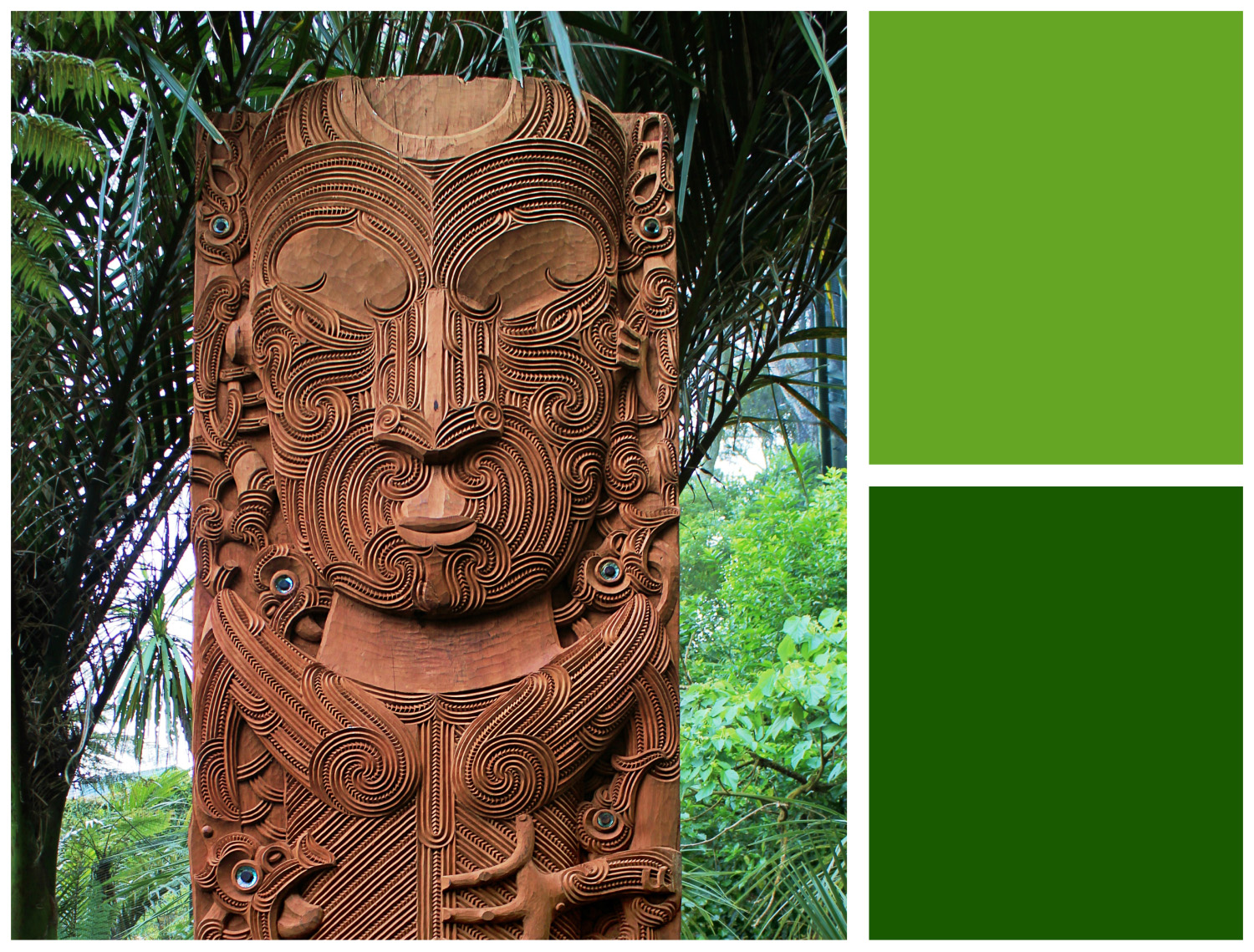
The primary logo for NZQA is composed of large initials followed by the full organisation title below, appearing first in te reo Māori then English below. The koru pattern in the Q is inspired by te orokohanga mai o te whakaaro (the origin of thought). This speaks to the process of how knowledge is acquired, how it is used and how it is passed through the generations and evolves on its journey. The tohu was gifted to NZQA by Whakaaro Factory.
Logo variations were also created for use in different applications to ensure readability of all parts of the logo. A secondary horizontal logo was created to be used in applications such as the website header which is short but wide. We also produced a version with the initials only, for use in mobile. And lastly, the Q can be used on its own as a large watermark or a small website icon.

Colour palette
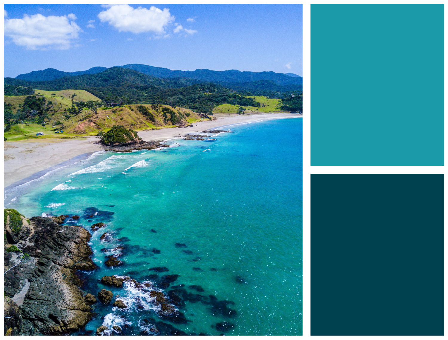
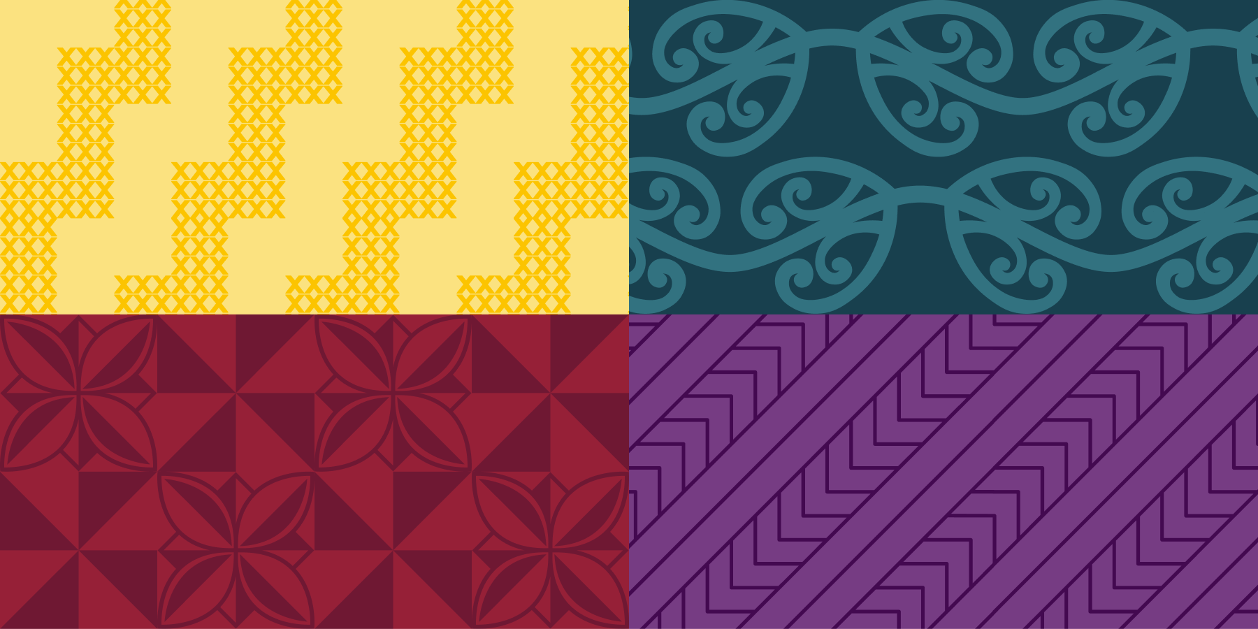
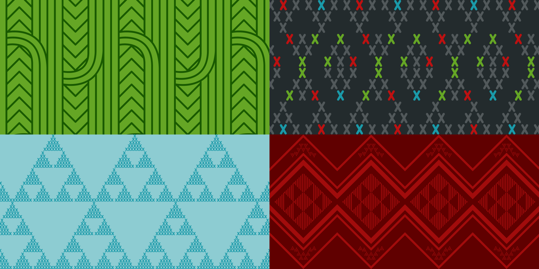
The full NZQA colour palette is inspired by te ao Māori and the natural world. Blue is the primary brand colour and was chosen because it represents water. In te ao Māori and many other indigenous cultures around the world, water holds generations of information and knowledge which is one of the many reasons why it is believed to be so precious. The supporting dark blue colour acknowledges the god of the ocean, Tangaroa, and symbolises how the ocean connects us to the rest of the world's many shorelines. It represents a deep ocean, and in the context of education, a deeper level of learning. The extended set of colours in the colour palette represents the many NZQA audiences. These colours include yellow, purple, pink, green and red, and each were chosen to represent elements of the natural world.
Kowhaiwhai patterns
Alongside the colour palette, we also produced a series of kowhaiwhai graphics inspired by traditional patterns seen in te ao Māori. Each pattern used in combination with a designated colour represents one of the customer groups. This visual identity is something that is carried through print and web applications to help customers recognise when information is applicable to them. The patterns each hold meaning that were chosen by Whakaaro Factory to align with each audience, which includes learners, secondary school teachers, tertiary providers, Māori, and international students. Alongside the Māori patterns, a Pasifika pattern was produced by Isoa Kavakimotu, an Aotearoa-born Tongan designer and creative.
Services provided
- Workshops
- Discovery
- Indigenous Design & Consultation
- Branding Design
- Visual Identity
- Project Management


Work with us
Whether you’re looking for a project partner who can help you realise your epic digital vision, or you need a hand with your website, we can help.